Inflation & Prices
An in-depth look at inflation dynamics across Canada — CPI trends over time, geographic divergence across provinces, and sector-level price pressures. Generated directly from Statistics Canada microdata and refreshed automatically with each new data release.
Updated August 7, 202610 charts
Overview
Original analysis
Headline inflation against the Bank of Canada's 1-3% control range — the benchmark it is managed againstHow to read: The shaded band is the Bank of Canada's inflation-control range. The title changes on its own when the rate crosses the band's edges.Data through Jun 2026
OverviewOriginal analysis
Share of the CPI basket inflating above 5%, 3–5%, at target, below 1%, or falling — weighted by official basket weightsHow to read: Each colored band is the share of everything Canadians buy (by spending weight) whose price is changing at that pace — the red area shows how much of the basket is inflating above the Bank of Canada's target range.Data through Jun 2026
OverviewOriginal analysis
Headline CPI vs the Bank of Canada's three core measures (CPI-trim, CPI-median, CPI-common), with the 1–3% target bandHow to read: Headline inflation bounces around with gas and mortgage rates; the Bank of Canada steers by these three core measures that strip out the noise — when they sit above 3%, rate cuts stay on hold.Data through Jun 2026
OverviewOriginal analysis
Cumulative price growth since January 2020 — groceries, gasoline, all-items, and the average wageHow to read: Inflation slowing just means prices are rising more slowly — not falling. Every line shows how much higher prices are than at the start of 2020.Data through Jun 2026
OverviewProvincial
Original analysis
Each province's inflation against its own ten-year range, with the national rate markedHow to read: The national number can hide the spread: provinces are ranked, each against its own usual range, with the Bank's 1-3% band behind them.Data through Jun 2026
ProvincialSmall-multiples trend lines for each provinceData through Jun 2026
ProvincialSectors
Original analysis
Each CPI component against its own 25-year range, ranked by how unusual today's rate is rather than by sizeHow to read: A volatile component is often large without being unusual. Ranking by each component's own percentile separates the two.Data through Jun 2026
SectorsEach CPI component's contribution in percentage points, against published headline inflationHow to read: Blocks below zero are prices pulling inflation down, so the top of the coloured stack is not the total — the black line is.Data through Jun 2026
SectorsOriginal analysis
The largest contributors to headline inflation, ranked by contribution rather than by rateHow to read: Ranked by contribution — a big price rise on something you rarely buy moves the headline less than a small rise on rent or groceries.Data through Jun 2026
Sectors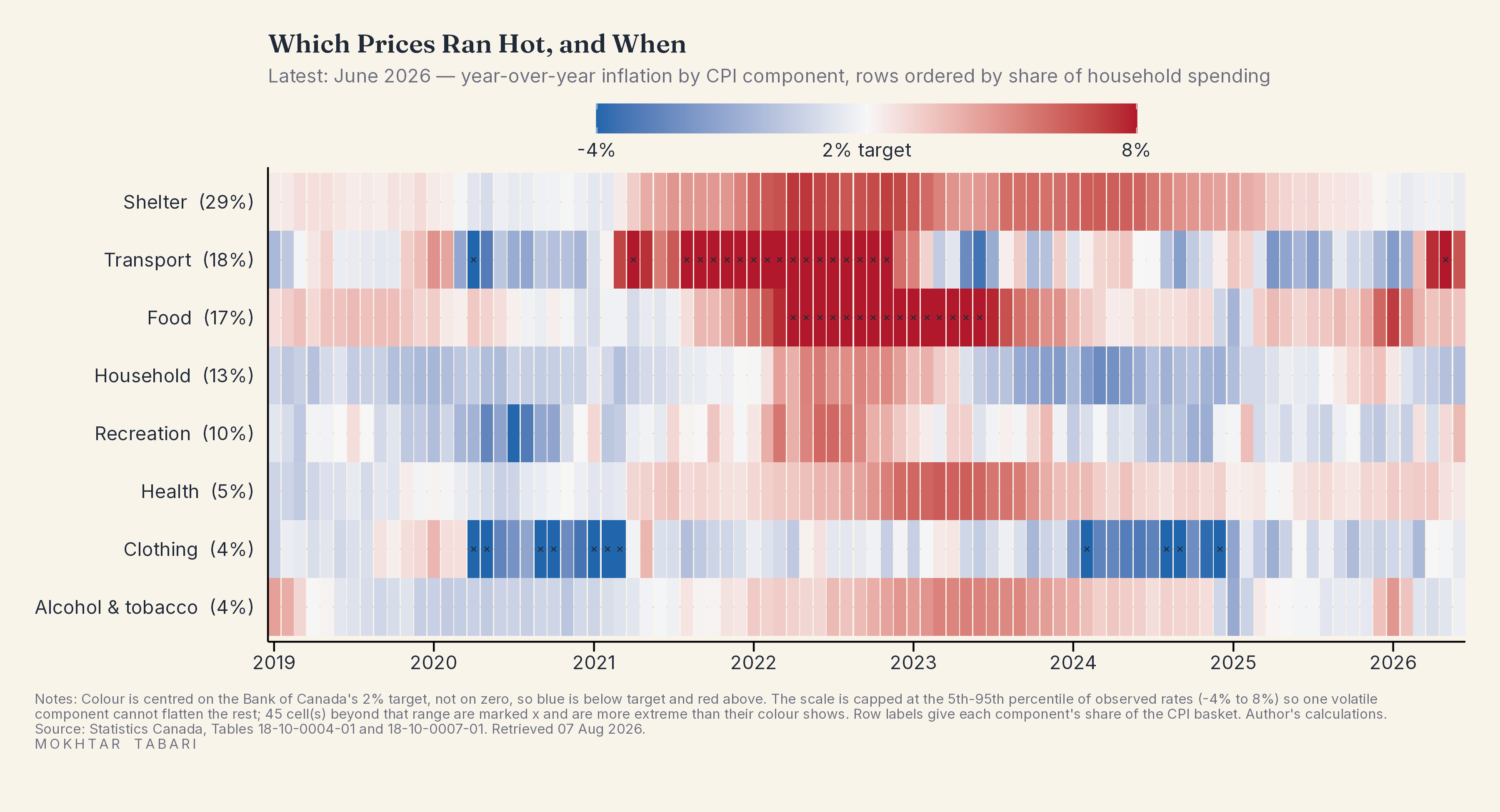
Year-over-year inflation by CPI component, centred on the 2% target and ordered by share of spendingData through Jun 2026
Sectors